3 Attention-Grabbers for your Crowdfunding Rewards
Using images and graphics for your crowdfunding rewards can help convert casual visitors to motivated crowdfunding backers
With more than 7,000 crowdfunding campaigns on Kickstarter, the campaign that fails to go beyond the simple process is likely to end up with the 60% of projects that fail to reach their funding goal. Nearly everyone has a video and most campaigns take the time to put together a good list of rewards. These just aren’t enough to set you apart from the crowd anymore.
But there is still one thing you can do to help convert campaign page visitors to motivated crowdfunding backers, through creating an infographic or image out of your crowdfunding rewards!
People are visual. We like images and graphic displays of information and it seems we’re hard-wired this way. Nearly 50% of your brain is involved in visual processing and 70% of all your sensory receptors are in your eyes.
While most crowdfunding campaigns build in images and graphics into the page through the video and pictures, fewer build out a graphic for their crowdfunding rewards.
Make it easy for people to understand your crowdfunding rewards
Besides the preference to great visual graphics, images help us cut through the clutter as well. We get bombarded with information from every part of our daily lives. Pictures and images help to get the general idea without having to read through a page of content. The old saying that a picture is worth a thousand words is more true than you realize for your brain.
When you’ve looked at as many crowdfunding campaigns as I have, you get tired of scanning through the same old list of crowdfunding rewards. Gee, for $5 I can get a personalized thank you or a t-shirt for a few dollars more. Big surprise. Even the interesting rewards on a lot of campaigns fail to really make an impression.
Why? Because (on Kickstarter) it’s all the same three-inch wide boxes with a few sentences of text descriptions. And that is on a standard-size computer screen, what are mobile viewers seeing when they scan through your crowdfunding rewards?
Worse yet, studies show that people spend an average of 15 seconds on a webpage before they click out. That means they are scrolling through your page, looking at bullet points and images to get the general idea before deciding to stick around or to leave.
Images attract attention and make it easy for people to make a decision. If you’re going to put together a kick-a$$ set of rewards for your crowdfunding campaign, don’t pass up the chance to make them visually-appealing to visitors as well.
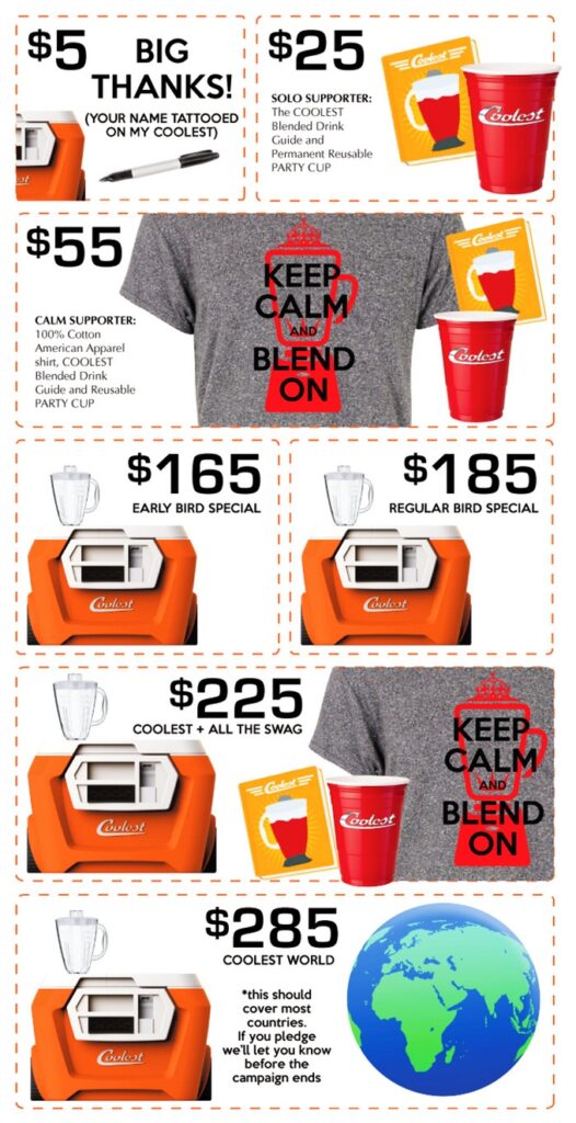
One of the legends of Kickstarter, the Coolest Cooler, is a great example of using a crowdfunding rewards graphic. The image is perfect in its simplicity. It’s basically just a photo montage of the rewards but really well done and with persuasive descriptions. I like the coupon-look with the dashed lines as a way of persuading visitors to the idea that they’re getting something at a discount.
The Coolest Cooler campaign raised more than $13.2 million from 62,642 backers and is one of the most popular campaigns of all-time. This didn’t all happen by chance.
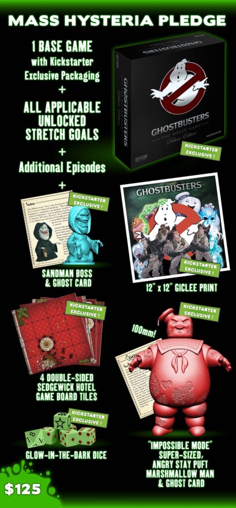
Crowdfunding game-maker Cryptozoic has perfected the art of crowdfunding rewards promotion and raised over $3 million for two games. The image below is the third pledge level on its Ghostbuster’s game which ended up raising $1.5 million. The reward level was for $125 and easily beat out all other levels, raising nearly $900k from 6,951 backers.
Besides professional photography and artwork, the campaign offered a huge value in each reward level. This reward level was just $10 above the previous and offered everything in the image. Think about it, would describing the Stay Puft Marshmallow Man figurine have had the same appeal as actually showing gamers what they were getting?
How to turn your crowdfunding rewards into awesome graphics
Providing a visual element to your crowdfunding rewards isn’t a difficult process. The three options I see most frequently are basic photography, photoshop creations and infographics.
The Coolest Cooler page offered a good example of basic photography. Nearly all the images were simple photographs of the rewards, set against a background with some content. You can do this at home with a white sheet and a hi-res camera. Even some of the better smartphones offer strong enough resolution to get the job done. The Apple iPhone 6 has an 8 megapixel camera and some amazing video capture.
Take the time to learn a little about lighting if you are going to do the photography yourself. You will need to place the lights just right so you don’t get a shadow. It might be worth it to reach out to someone in your crowdfunding community that already knows about photography to help support the campaign.
It will take a little more experience with image creation software like Photoshop to put something like the Cryptozoic image together but it can also give your crowdfunding campaign a great professional look. Again, reach out to the community you’ve built through pre-launch activities to find someone that can help with graphic design and layout. This kind of support is usually overlooked in crowdfunding but a great way to get extra help and bring people closer to the project. Check out our prior post on other ways people can support your crowdfunding campaign and how to ask for help.
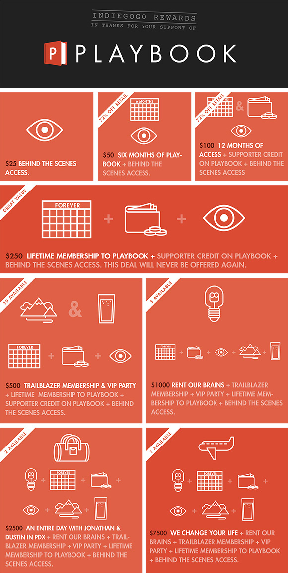
Creating an infographic of your crowdfunding rewards is even easier than the other two methods. The Indiegogo campaign for Playbook raised $12,506 from 205 funders for the work –coaching program. The infographic is very simple and can be built with standard icons on most infographic websites like Piktochart. I think some of the visual appeal is lost by not using photographic images but the infographic still grabs visitors attention and gets your message across better than the standard content description of rewards.
I like how the graphic calls out discounts to retail price and limited availability of the rewards. Make it easy for visitors to see the value they’re getting by coming in as crowdfunding supporters instead of waiting.
Infographics can also be put together fairly easily with Microsoft Publisher though it might not be as user-friendly as the websites specifically designed for the purpose. Most sites like Piktochart have ready-made templates and free license programs for basic features.
There are cost-effective solutions to putting your crowdfunding rewards graphics together through freelancers on sites like Fiverr and Upwork. I’ve used both of the sites to find technical help but have had mixed results. Generally, you are going to get what you pay for so do not expect professional graphic design for five dollars. It is better to reach out to your community for the services, even if you have to offer some compensation.
Don’t pass up the chance to graph visitors’ attention and convert them to backers through graphics and images of your crowdfunding rewards. The extra effort and budget can be marginal but well worth it by giving visitors a quick and persuasive way to scan your rewards.
